
Every brand undergoes evolution. It is a sign of growth, adaptation, and a deep understanding of one’s audience and the changing times. We’ve recently introduced a new logo, a modern take on our original design that has been with us since our beginning. I’d like to guide you through how this update encapsulates our company’s forward-looking values.
The Rationale Behind the Evolution
Brands, like living entities, grow and evolve. In the fast-paced digital age, it’s crucial for brands to be adaptable yet consistent. As our studio has expanded, diversified, and embraced new technologies and methodologies, we realized that our logo needed to reflect this evolution. While we remain proud of our roots, it’s essential to project a fresh and forward-looking image to our audience.
A Nod to the Past
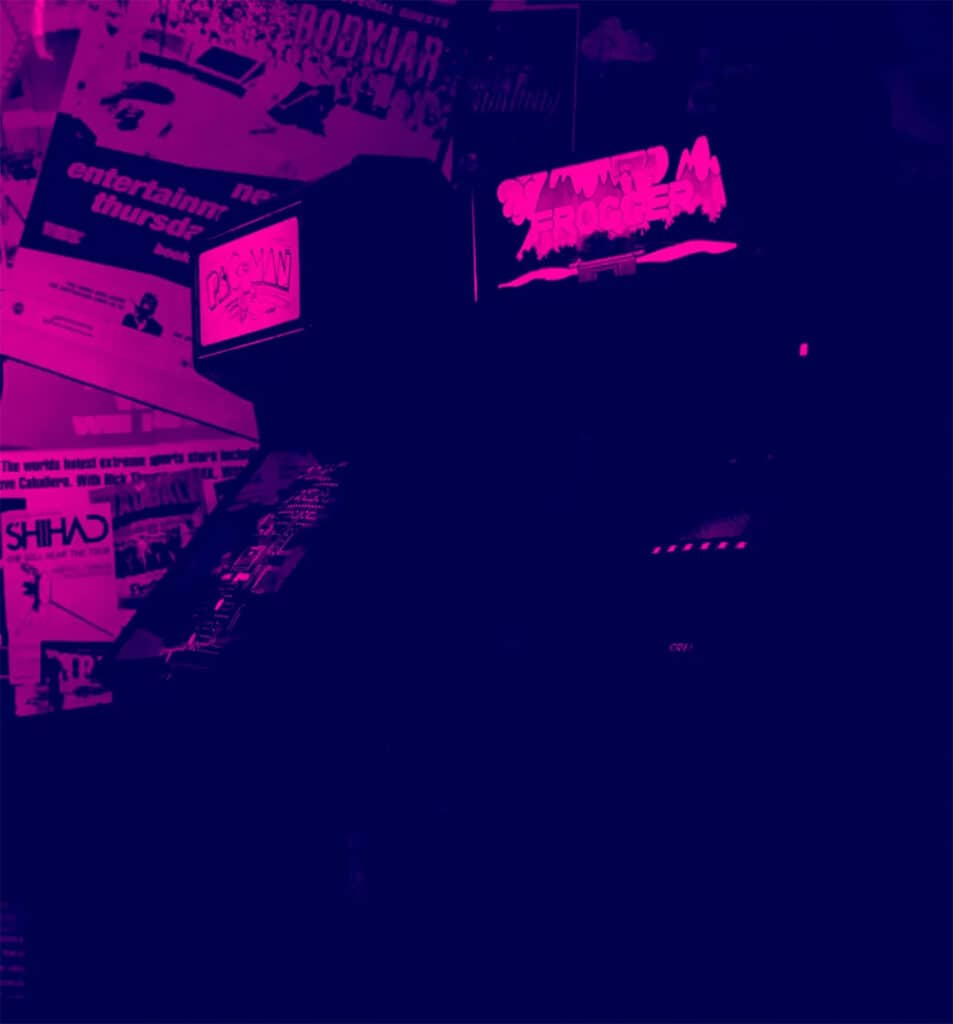
The era of the arcade, which peaked in the 1980s, was a magical time for video game designers and technology because it represented a time of rapid technological advancement and creativity in the video game industry.
Game designers pushed the boundaries of what was possible with game technology, creating games that were not only technically impressive but also emotionally resonant.
Ultimately, the era of the arcade was a time when anything seemed possible, and game designers were free to explore new ideas. The legacy of the era of the arcade can still be seen today in the popularity of classic arcade games and the enduring influence of the designers who created them.
Azra Games’ visual branding pays homage to this era by bringing subtle design elements that were popular at the time into the modern day.
The Strike
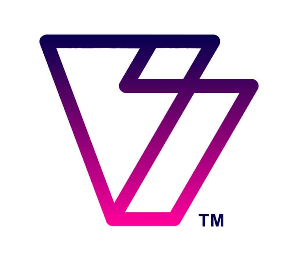
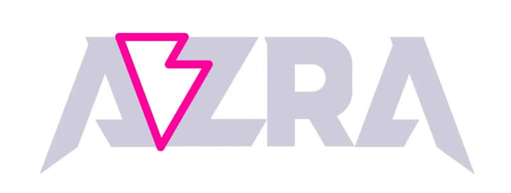
“The strike” is our logo mark which is composed of the negative space between the “A” & “Z” in our original word mark but beneath its construction, it pays homage to the Era of the Arcade.
The shape represents a stylized silhouette of an arcade cabinet, evoking memories of classic arcade games and the excitement of stepping up to the machine for a chance at high scores and victory. At the same time, it can be seen as a stylized lightning bolt, symbolizing energy, excitement, and innovation. The lightning bolt serves as a nod to the future of gaming and the industry’s ongoing evolution.
The combination of these elements creates a dynamic and striking logo that captures the spirit of our brand and our commitment to delivering exceptional gaming experiences.
The Logo
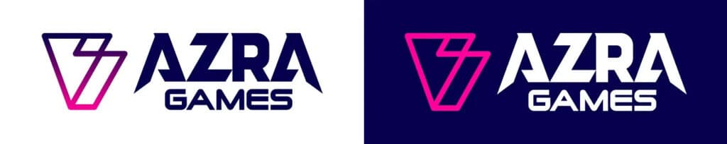
The Azra logo is a sleek and modern design that captures the essence of the brand’s focus. Comprised of “the strike” and a stylized word mark that symbolizes progress and movement, in a bold, futuristic font to convey a sense of excitement and energy.
Our logo is a versatile design that can be used across a variety of platforms and applications and is aimed to resonate with the brand’s target audience of gamers who are passionate about action RPGs.
What Else Is New?
At first glance, long-time supporters will recognize familiar elements — a testament to our dedication to preserving our brand identity. However, we have refined some important elements:
- Color Palette: We have refined our colors to ensure more consistency with our brand.
- Typography: Our fonts have been chosen to be modern and approachable. The subtle changes in the typeface reflect our commitment to innovation while being grounded in our core values.
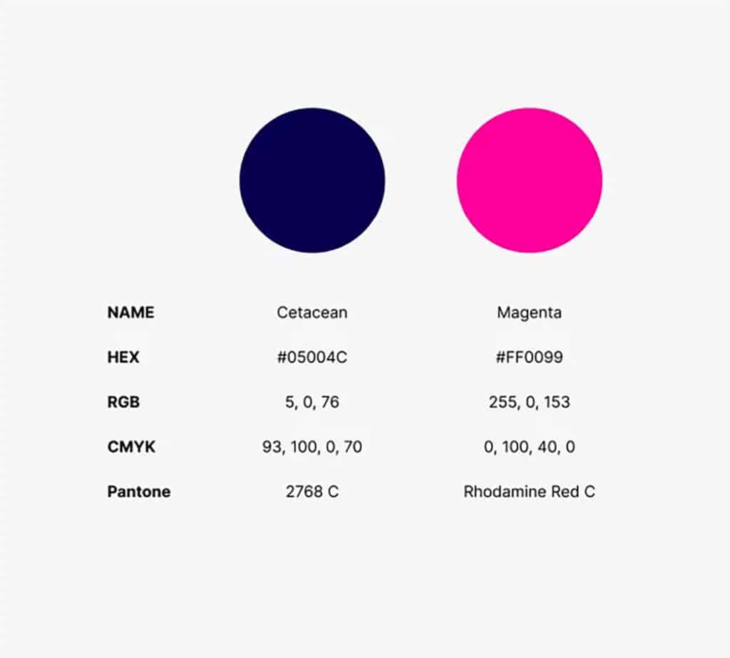
Azra Games’ Core Colors
In Conclusion
As we transition to this new phase, we’d like to extend our heartfelt gratitude to our community for being a part of our journey so far. This logo evolution is not just a visual change; it’s a reflection of our ambition to grow, serve better, and reach greater heights together.
We’re excited about this new chapter and invite you to join us in embracing this change. After all, it’s more than just a logo; it’s the spirit of our brand, evolved.